Monday 30 November 2015

Why Not Marriage?

      Marriage rates of adults in their mid-to-late twenties have seen a decline most everywhere, though the steepest declines are those found in western Europe. The United States has a decrease of just over 40 per cent, but France and the United Kingdom top the list at a decrease of well over half since the early 1970's. Canada registers at a relatively modest decline in comparison. China boasts the highest marriage rate among those countries in the first chart (Canada, France, the UK, and the US), but it wasn't possible to get data for China prior to the 1980's so the picture is not entirely complete.


      This data paints a stark picture of the decline of marriage all around the world, and leaves us searching for the reasons why. Is marriage less important these days? Or is marriage simply less accessible?


      The rising divorce rate has something to do with the decrease in married women in their mid-to-late twenties. It's become more feasible to live separately, and obtaining a divorce is now a fairly simple procedure (expensive, but simple). Add to that, in some places like Italy, Ireland, and Spain divorce wasn't legal but now is, and it's not difficult to see how rising divorce contributes to the decline in marriage rates.

       Divorce isn't the only factor that contributes to the declining popularity of marriage. Culture plays a large role, and always has, in the acceptance of marriage as a steadfast tradition. Now, especially among the younger  European generation, there has developed an apathy towards the traditional institution of holy matrimony. Young people in many places around the world can now live together, have children together, outside of the bonds of marriage without the censure that once accompanied such an act. Financially and culturally, it's just not a big deal anymore. Living together in a common law partnership is a great way to save money, and in the tough economic circumstances of the United States and much of Europe, cutting out the expense of getting married makes sense. Add to that, many young adults around the world are still living at home with their parents due to rising housing costs, which makes marriage a more difficult prospect.

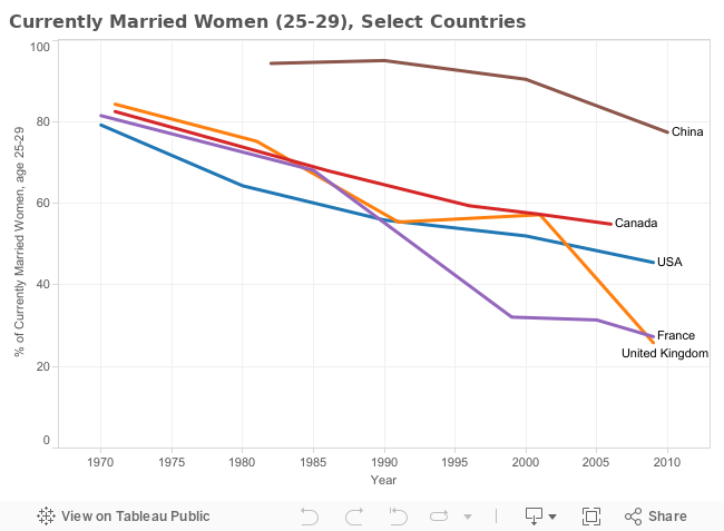
       The economy may have more to do with declining marriage rates, especially in the US and Canada, than simply diminished cultural significance. One study alleges that because of the growing number of educated women in the Western world, and the decline of the stable, lucrative job among men in the same areas, women are choosing to forego marriage in favour of waiting for a better prospective partner. This sees young women marrying later in life, a fact that is supported by the chart below, which shows less of a decrease in marriage rates in women above 29 years old.


       Though marriage has always been the benchmark of a normal "family formation", it's clear that the norm is being challenged, and eroded. From this data it's possible to see that the future of wedded bliss is very much an uncertain thing.

Sunday 15 November 2015

Then and Now: Matrimonial Decline

This series of charts offers several ways to examine how marriage rates for women have altered over time, age group, and country. In the first chart, it's possible to segregate information by age group, focusing solely on a single age group at one time, whilst comparing that age group between country and time period.


The second and third charts function best when used together, giving the ability to compare all age groups, countries, and time periods at once, however, these two charts can also be used as separate entities if the only desire is to examine a specific time period.


A question which cannot be answered by this series of charts is whether or not there are corresponding levels of divorce rates, which might imply the conclusion that women are still getting married just as much, but are not staying that way, instead of the conclusion that women simply aren't marrying at the rates and ages they used to marry at. To answer this question, it's possible to look to the United Nations vast online vault of data, using the search engine to see if they have a corresponding spreadsheet of divorce rates for these same countries. In fact, a quick search of the UN database shows that this spreadsheet has the exact information needed, and could be used to validate or invalidate the theory of correspondence between marriage rate decline and divorce rate increase.

Wednesday 4 November 2015

Where's the love, and are men to blame for its loss?

      Marriage rates of adults in their mid-to-late twenties are on the decline most everywhere, though few are so high as those found in western Europe. The United States boasts a decrease of just over 40 per cent, but France and the United Kingdom top the list at a decrease of well over half since the early 1970's. Canada registers at a relatively modest decline in comparison. Should we be holding men accountable?

      New studies point a finger to the uneven ratio of men to women for skewing the numbers, at least in North America. In Europe, a predominant theory for matrimonial decline among young adults is the renunciation of Old World traditions in favour of a more liberal, individualistic sentiment.

      This spreadsheet is a section of data from the United Nations, and it illustrates the decreasing percentage rates of marriage in Canada, France, the UK, and the U.S.


Tuesday 13 October 2015

The Possibility of Marriage

Image courtesy of pengrin

1. What dataset will you use for your final report?
     I chose a large dataset that details currently married men and women around the world. This dataset is provided courtesy of the United Nations data site, compiled in 2012, and reaching back to pull data from as far as the 1970's.

2. Describe the dataset. What kind of data does it contain?

     In this dataset, it's possible to see the amount of men and the amount of women married in the different countries of the world. It's broken down into age categories, time periods, and sex (men/women), as well as whether or not the numbers include consensual unions (the unions that are not formally recognized by dominant laws). The UN also provides great detail on the further areas of the population that have been excluded from the dataset, and other limitations such as low census return rates.

3. Is there anything about your data that you don’t understand? How will you find this out?

     One thing I'm not certain of with this dataset is whether the numbers represent a percentage of that age group within the population, or something else. I have this doubt because of the ridiculously high numbers in certain populations. 96% of men aged 40-44 in 2008 in Afghanistan seems steep. Conversely, it's confusing to see that only 80% of women in the same place, year, and age bracket are married. I think this might be explained by the ratio of men to women being lopsided, but it's something I'll have to explore.

4. What are some questions you hope to answer with your data? List at
least three.

     To start, I'd like to know which country/year/age/sex has the highest number of married people, and which has the lowest. That's the obvious stuff. I'd like to contrast first world countries with each other, and also with third world countries. I'd like to compare European countries with North American countries, as well, to see if I can find a discernible difference that might be attributed to different cultural practices. I'm also interested in finding out which countries have the highest ratios of men to women married, because, as noted above, there are discrepancies there that intrigue me. Finally, I'm interested in answering the question of how marriage rates in different countries have changed over time. 

Tuesday 29 September 2015

Infographic Critique - Assignment #1 (AKA "All the Dots")

    This infographic allows you to compare your height and weight with the heights and weights of the NFL 2015 athletes. It's a fantastic tool if you want to see which men share your body measurements but make far more money than you with them. Oh, and if you're at least 161 lbs., and 5'8". Everyone else? Sorry, this tool is not for you. 
    If you manage to fall into the elitist body-type bracket, this graph gives you the ability to see how you stack up, but it doesn't tell you how to properly employ that ability. Instead, there is a single title which explains the content, and then a whole array of confusing options with no descriptive, nor any opening introduction to clue the user in. An introduction would have been a welcome addition. What does the bar chart at the top do? How do I properly use the various search options? How do I tell which of these players is single and makes the most money?
    If the lack of explanation wasn't complicated enough, all you have to do is turn your gaze to the right of the page and allow your mind to boggle at the vast array of dots.
                                                              Dots, everywhere.  
                                                               

     The dots on the outskirts have names, the dots on the inside do not. Why? Space issues aside, I couldn't tell you, because it's just not clear. It might have been better to forego the labels altogether, especially as it gives you an option to do so in the search fields which makes the labels (and the option to forego them) seem like unnecessary clutter. An info box pops up with the name and stats when you mouse over it, anyway. The same thing could have been done with the various search fields on the left hand side of the screen, where an info box describing how to use each particular function would have had more impact and been more helpful.
     Finally, less is more. Get rid of the dots and the lines and the shades of beige and blue-green, at least at first. Start with a clean slate and give the user the choice to overwhelm themselves with dots. There is an 'All' option so there's no worry that they won't be able to see every single beefy athlete at once if that's what they want to do.